Internet Explorer 4.0 adds full support for HTML 4.0, the next version of HTML to be embodied as a W3C recommendation. This section introduces the features newly incorporated into HTML 4.0. (Some of these features were available in Internet Explorer 3.0 but are only now being incorporated into a W3C recommendation.) At the time this book was written, HTML 4.0 was to include the following new features:
Framesets and IFrames, table enhancements, and the Object and Script elements have all been supported since Internet Explorer 3.0. Internet Explorer 4.0 expands on the earlier version by providing support for the rest of the features in the preceding list. For information about HTML 4.0 and these features, check out the W3C Web site (www.w3.org) and Microsoft's Web site (www.microsoft.com). The scripting of these new elements and attributes is discussed throughout this book.
The rest of this section introduces the HTML syntax for the Object element, form and accessibility enhancements, and a few other HTML features supported by Internet Explorer 4.0 that go beyond HTML 4.0.
Chapter 2, "Fundamentals of HTML Scripting," focuses on the Script element, the primary mechanism for embedding scripts in the document. Framesets are introduced in Chapter 5, "Window and Frame Management."
The table enhancements are not discussed in detail in this book. These enhancements include specifying table headers, footers, and bodies as well as providing greater control over columns. More information about the table enhancements can be found at the Microsoft Web site.
A named entity consists of predefined characters that can be embedded in the document using &name;. For example, a commonly used named entity is the nonbreaking space ( ), which inserts a space that won't wrap at a line break in the document.
The Object element is used to embed custom objects in an HTML document. This element was initially supported in Internet Explorer 3.0. The Object element is used to extend HTML by embedding Java applets, ActiveX controls, and supported MIME types in Internet Explorer. Supported MIME types include HTML files and the various image formats, such as GIF, JPEG, and PNG. The syntax for the Object element is generally as follows:
<OBJECT CLASSID="ActiveX UUID" WIDTH="pixels" HEIGHT="pixels">
    <PARAM NAME="property" VALUE="propertyValue">
</OBJECT>
In addition to specifying the CLASSID, an optional CODEBASE parameter can be specified to provide a location from which to download the object. Parameters can be specified through one or more Param elements contained within the Object element.
The only valid contents within an Object element are Param elements. Browsers that support the Object element ignore all other HTML within the Object block. This feature can be used to provide contents for down-level browsers that do not support the Object element, as shown here:
<OBJECT CODE="myClass.class" WIDTH=200 HEIGHT=200>
   <PARAM NAME="color" VALUE="red">
   <PARAM NAME="background" VALUE="green">
   <P>Your browser does not support the Object element and
      cannot view the application.</P>
</OBJECT>
HTML forms were initially limited to requesting basic information from the user. The interface was limited to plain-text containers, radio buttons, and check boxes. Forms in HTML are evolving to provide more of the power and flexibility that existing form and database packages permit. In addition, many of the enhancements related to forms also greatly improve accessibility, allowing users with disabilities to better access a page with their browsers.
NOTE: Throughout this book, the term intrinsic controls is used to refer to the built-in controls in HTML. Intrinsic controls include all elements the user directly interacts with for input and output, such as the image, text, button, and marquee controls.
The set of form enhancements in HTML 4.0 allows you to add labels and access keys, add advisory text to all elements, control tabbing order, disable controls, and group related controls. In addition, Internet Explorer 4.0 enhances the intrinsic form elements with support for style sheets and for default and cancel buttons. Buttons and text boxes can be created using different fonts and colors based on style sheets. The use of style sheets is introduced in the section "Cascading Style Sheets" later in this chapter.
Adding Labels and Access Keys
The new Label element is an inline text container that can associate contents with a specified control. Label elements are to controls what links are to bookmarks: just as links bring a bookmark into view, when the user clicks a label the associated control is brought into view and given the focus. For radio buttons and check boxes, clicking on the label also clicks the associated button, changing its value.
Just as the <A> tag that defines a link references a bookmark, the <LABEL> tag references an associated control element using a FOR attribute. The FOR attribute contains the unique ID of a control on the page. The following code creates labels for a check box and a text box:
<HTML>
   <HEAD>
      <TITLE>Label Demonstration</TITLE>
   </HEAD>
   <BODY>
      <H1>Label Demonstration</H1>
      <TABLE>
         <TR>
            <TD NOWRAP>
               <LABEL FOR="Info">Send Information: </LABEL>
            </TD>
            <TD>
               <INPUT TYPE=CHECKBOX ID="Info" VALUE="Information">
            </TD>
         </TR>
         <TR>
            <TD NOWRAP>
               <LABEL FOR="Email">E-Mail Address: </LABEL>
            </TD>
            <TD>
               <INPUT TYPE=TEXT ID="Email" SIZE=30>
            </TD>
         </TR>
      </TABLE>
   </BODY>
</HTML>
Figure 1-1 shows this label demonstration in action. When a buttonlike control is activated, its label is drawn with a dashed border around it. The label itself can also be clicked on to activate the control.
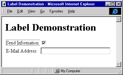
Figure 1-1. The Label Demonstration Web page.
The Label element adds the capability to associate contents with a control. To help improve the accessibility of the Label element, HTML 4.0 also provides an ACCESSKEY attribute. The ACCESSKEY attribute contains a single character that can be used as a shortcut for referencing the control: pressing the Alt key followed by the access key character accesses the shortcut. (The access key is not case sensitive.)
The following code creates a label with an access key:
<!-- Label with an access key -->
<LABEL FOR="txt1" ACCESSKEY="U">
   <SPAN CLASS="accesskey">U</SPAN>ser Name:
</LABEL>
<INPUT TYPE=TEXT ID="txt1" SIZE=30>
The purpose of the <SPAN> tag in this example is to use a global style that defines how the access key in the label's text should be rendered. Microsoft Windows traditionally underlines access keys. This underlining can be accomplished in HTML by adding the following global style and wrapping the access key in the label's text with <SPAN> tags:
<STYLE TYPE="text/css">
.accesskey {text-decoration:underline}
</STYLE>
The U element could be used as an alternative to the global style to force an underline. However, that technique does not provide the benefits of style sheets. Using a global style makes it easy to change the appearance of all access keys in the document.
Labels degrade gracefully in browsers that do not support them. Because the <LABEL> tag is ignored by down-level browsers, those browsers render the label as plain text. (Browsers that understand style sheets underline the access key letter.) The Label element significantly improves usability and accessibility and is highly recommended wherever controls are used.
Adding Advisory Text to an Element
All HTML elements now support the TITLE attribute, an advisory string that is rendered in Internet Explorer 4.0 as a ToolTip. A ToolTip is a small window of text that is displayed when the mouse pointer hovers over an element. A ToolTip can be associated with any element, allowing everything from a control to a heading to display extra information. Changing the input check box created earlier to include a TITLE attribute displays a ToolTip when the mouse pointer hovers over the check box:
<INPUT TYPE=CHECKBOX ID="Info" VALUE="Information"
   TITLE="Check here and enter your user name for more information.">
Figure 1-2 shows the ToolTip Demonstration application in action.
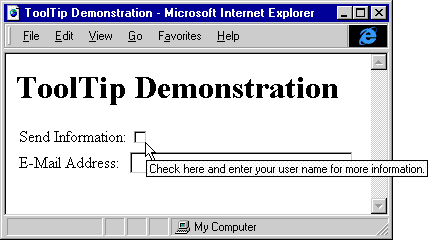
Figure 1-2. The ToolTip Demonstration Web page.
As with the <LABEL> tag, the TITLE attribute raises no down-level browser issues because the attribute is ignored. Therefore, using this attribute is recommended when extra information might be helpful. The most common uses of the TITLE attribute are on links, for extra information about the link, and on controls, for information about the contents of the control.
Controlling Tabbing Order
A TABINDEX attribute was added in HTML 4.0 to all the input controls on the document. This attribute lets the Web author explicitly control the tabbing order. By default, the tabbing order of all elements on the page matches the order in which they are defined in the HTML source. The TABINDEX attribute lets the author control the tabbing order among elements, independent of the source order of the document. Supplying a negative TABINDEX value in an element causes the element to be skipped in the tabbing order.
While elements within a form belong to the form, the TABINDEX attribute applies to the entire document. Therefore, only one element in the document should have a tab index of a particular value. The source order resolves any conflicts in which multiple elements share the same tab index value.
Disabling Controls
Disabled controls are controls that cannot be activated or whose contents cannot be changed. In HTML 4.0, two attributes are exposed that prevent the contents from being edited: READONLY and DISABLED. The DISABLED attribute makes the element unable to receive the focus, and hence unable to receive any events. DISABLED should be used when a control is not applicable to the current context. For example, if prerequisite information must be entered before a control can be used, that control can be disabled until the correct information or state is reached. Disabling a control is a simple process:
<!-- Disabled Control -->
<INPUT TYPE=SUBMIT ID="btnSubmit" VALUE="Submit Data" DISABLED>
When appropriate data is entered that makes the submission valid, the Submit Data button can be enabled through a script. Examples of dynamically manipulating form elements with the object model are presented in Chapter 10, "Forms and Intrinsic Controls."
The READONLY attribute is used when the control is applicable to the context but the contents of the control are not editable. Unlike a disabled control, a read-only control can receive the focus and its contents can be selected. However, its contents cannot be changed. The READONLY attribute is applicable only for elements the user can enter data in. For example, Button elements are never editable, so supplying a READONLY attribute for a button control would be redundant.
A read-only control does not appear different from a control that is editable; a disabled control in Windows, however, appears grayed. The following code demonstrates how to make the E-Mail Address field from Figure 1-1 disabled:
<INPUT TYPE=TEXT ID="Email" SIZE=30 VALUE="UserName@com"
   TITLE="To enter an e-mail address, first check the Send
      Information check box."
   DISABLED>
Figure 1-3 demonstrates a disabled text box. A script can enable the text box when the user checks the Send Information check box.
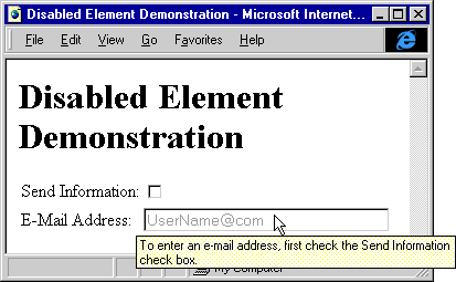
Figure 1-3. The Disabled Element Demonstration Web page.
HTML 4.0 provides a powerful new Button element that enables rich HTML contents to be displayed as a button. For instance, the following Button element can be added to the Label Demonstration example:
<!-- HTML-based button -->
<BUTTON STYLE="font-family:Arial; font-size:16pt; color:navy">
   Send Me
   <SPAN STYLE="font-style:italic; color:green">Information!</SPAN>
</BUTTON>
Figure 1-4 shows the Button Demonstration application in action.
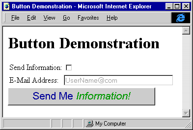
Figure 1-4. The Button Demonstration Web page.
Buttons can be created with all the flexibility available in HTML and style sheets. The only disadvantage to the Button element is that down-level browsers render the contents not as a button but as normal HTML text. Therefore, for down-level browsers, you must define another button within the Button element by using an <INPUT> tag:
<BUTTON STYLE="background:URL(cool.gif) yellow; font-weight:bold">
   <P ALIGN="Center">Calculate</P>
   <P ALIGN="Center" STYLE="font-style:italic">Now</P>
   <!-- The following button is for older browsers. -->
   <INPUT TYPE=BUTTON VALUE="Calculate Now">
</BUTTON>
In browsers that support the Button element, the <INPUT> tag is ignored, and in down-level browsers that do not support the Button element, the HTML is still rendered, plus a button is also displayed.
NOTE: This technique, in which the up-level browser ignores the alternative HTML, actually creates an invalid document because the DTD that defines HTML prohibits Input elements within a Button element. However, this technique is demonstrated here because it is currently the only way to use a Button element effectively with down-level browsers that do not support the <BUTTON> tag.
The Fieldset element is used to group form controls, similar to the way <DIV> tags are used to group related HTML contents. The Fieldset element was designed mostly for accessibility, allowing pages to clearly group sets of controls. For example, an invoice form may contain three fieldsets: a shipping address, an order section, and billing information. If you specifically group the fields using a Fieldset element, a browser can easily distinguish the three groups. The Fieldset element is rendered by Internet Explorer 4.0 to look similar to group boxes in dialog boxes:
<!-- Grouping related controls -->
<FIELDSET>
   <LEGEND>Size</LEGEND>
   <INPUT TYPE=RADIO VALUE="Big" NAME="SIZE" ID="BIG">
   <LABEL FOR="BIG">Big</LABEL>
   <INPUT TYPE=RADIO VALUE="Small" NAME="SIZE" ID="SMALL">
   <LABEL FOR="SMALL">Small</LABEL>
</FIELDSET>
Figure 1-5 shows an example Fieldset element.
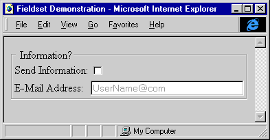
Figure 1-5. Fieldset element containing a group of related controls.
The fieldset can contain a single legend displayed on the fieldset's border. The legend can be followed by any HTML contents. The fieldset works fairly well on down-level browsers and is recommended for grouping related fields, but <DIV> tags should still be used to group related HTML contents.
Internet Explorer 4.0 adds two simple usability enhancements: The Submit button now acts as the default button for a form, meaning that the button is activated when the user presses Enter within a form. The Reset button acts as the cancel button for a form, meaning that the button is activated when the user presses Esc within a form.
The default and cancel buttons work within the scope of the currently active form. Therefore, if a document has multiple forms, the current default and cancel buttons depend on the form the user is interacting with. The Submit and Reset buttons can also work outside the scope of the form as the default and cancel buttons but without any default behavior. Outside a form, scripts are required to define a behavior for the buttons.
Figure 1-6 shows the default and cancel buttons. Default buttons specified using TYPE=SUBMIT have an extra border.
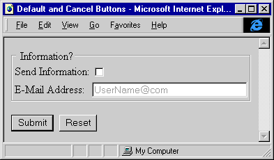
Figure 1-6. The default and cancel buttons.
The Marquee element is not new to Internet Explorer 4.0—it first shipped in Internet Explorer 3.0—but it is currently specific to Internet Explorer and is not a part of HTML 4.0. In Internet Explorer 4.0, the Marquee element has been extended to display HTML text and now includes the capability to scroll contents up and down in addition to left and right. The Marquee element is as rich as, and in some ways richer than, the Button element described earlier. Marquees can be created that contain controls and even tables, and all the event handlers for elements within a Marquee element fire appropriately. In addition, the marquee is now represented by a powerful object in the object model. Chapter 9, "Scripting Individual Elements," provides examples of using the Marquee element's object. The following code demonstrates an upward-scrolling marquee:
<!-- HTML marquee -->
<MARQUEE STYLE="height:150px" DIRECTION="Up">
   <TABLE>
      <CAPTION>Stock Ticker</CAPTION>
      <TR><TD>AAAA</TD><TD>100</TD></TR>
      <TR><TD>ZZFD</TD><TD>45</TD></TR>
   </TABLE>
</MARQUEE>
Internet Explorer 4.0 introduced the capability to bind an HTML page to a data source on the server and to bind different HTML elements to fields and data from that data source. When the page is loaded, the data is also sent from the server and asynchronously appears on the page. At a high level, this allows client/server Web pages to be created on which all the data is manipulated by the client. For example, a search engine can return a list of sites that can all be filtered and sorted by the client, without having to go back to the server. The data is instantly displayed on the page without reloading. The HTML data-binding enhancements are discussed in detail in Chapter 15, "Data Binding with HTML."