The CSS object model enables documents to adapt to the user's environment. Most of the examples in this chapter use dynamic styles to add effects or to allow the user to manually select alternative style sheets. The document's layout can also be changed based on the display resolution, window screen size, or other values intrinsic to the system. The following are a few high-level techniques you can use to create pages that adapt to the user's system:
The first three techniques are simple to add to a document. All the styles are declared using CSS, and scripting is used only to turn on and off the appropriate style sheet. Using the last technique, you can create pages that change in a much more procedural manner by directly manipulating the existing rules and adding new rules using the methods described earlier.
The following example uses the first three adaptive layout techniques. The document alternates between three main style sheets, depending on the window size. These three layout scenarios are merged with one of the two color schemes, based on the number of colors available. In addition, the navigation bar at the top of the window uses the color scheme of the system menus. All the style sheets are included within the document. Alternatively, they could have been defined as a linked style sheet and shared across an entire Web site.
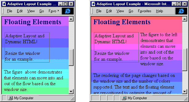
Figure 11-4 shows two of the document's alternative layouts.

Figure 11-4. Layouts of an adaptive document in narrow width and medium-width windows.
Figure 11-4 displays part of the document in narrow width and medium-width views. The most obvious difference between the views is the margins. The box appears above the text in the narrowest view and floats to the side of the text in the wider views, and the text changes to reflect the box's position.
Here is a full listing of the code for this example:
<HTML>
   <HEAD>
      <TITLE>Adaptive Layout Example</TITLE>
      <STYLE TYPE="text/css" ID="default">
         /* Default style sheet that is always applied to the
            document */
         /* Define the menu bar to match the built-in menus on
            the user's system. */
         .menu A.highlight {background:highlight; color:highlighttext}
         .menu {background:menu}
         .menu P {margin-left:5pt; margin-right:5pt}
         .menu A {color:menutext; text-decoration:none; font:menu}

         /* Define default margins. */
         body {margin-top:0pt; margin-left:0pt}
         .centerIndent {margin-left:5pt; margin-right:5pt}
         .leftIndent {margin-left:5pt; margin-right:5pt}
         .rightIndent {margin-left:5pt; margin-right:5pt}
         H1 {text-align:center}
         .outline {border:1pt solid gray; margin:2pt 2pt 2pt 2pt}
      </STYLE>

      <STYLE TYPE="text/css" ID="narrowScreen">
         /* Additional style rules for narrow screen;
            all contents for wide screens are hidden. */
         .wide {display:none}
      </STYLE>

      <STYLE TYPE="text/css" ID="midScreen">
         /* Rules for middle-size screen; hide narrow contents. */
         .narrow {display:none}
         .floatLeft {margin-left:0; width:150; float:left}
      </STYLE>

      <STYLE TYPE="text/css" ID="wideScreen">
         /* Nicest layout on the widest screen */
         .centerIndent {margin-left:15%; margin-right:15%}
         .leftIndent {margin-left:35%; margin-right:5%}
         .rightIndent {margin-left:5%; margin-right:35%}
         .floatLeft {margin-left:-154; width:150; float:left}
         .narrow {display:none}
      </STYLE>

      <STYLE TYPE="text/css" ID="4bit">
         /* Color depth of 4 or less */
         BODY {color:red; background:white}
      </STYLE>

      <STYLE TYPE="text/css" ID="8bit">
         /* Style sheets for 8 or more bits */
         BODY {background:URL(fancy.gif)}
H1 {color:purple}
H2 {color:navy}
</STYLE>
<SCRIPT LANGUAGE="JavaScript">
// Select the style sheet for the available color depth.
var ss = document.styleSheets;
ss["4bit"].disabled = (screen.colorDepth >= 8);
ss["8bit"].disabled = !(ss["4bit"].disabled);
function updateLayout() {
// Change style sheet based on available screen width.
var ss = document.styleSheets;
ss["wideScreen"].disabled =
(450 > document.body.offsetWidth);
ss["midScreen"].disabled =
(!ss["wideScreen"].disabled ||
300 > document.body.offsetWidth);
ss["narrowScreen"].disabled =
!(ss["wideScreen"].disabled &&
ss["midScreen"].disabled);
}
function highlight() {
// Highlight the Anchor element in the menu.
if ("A" == event.toElement.tagName)
event.toElement.className = "highlight";
}
function cleanup() {
// Clear the class.
if ("A" == event.fromElement.tagName) {
event.fromElement.className = "";
}
</SCRIPT>
</HEAD>
<BODY ONRESIZE="updateLayout();">
<SCRIPT LANGUAGE="JavaScript">
/* This call is in the body because updateLayout relies
on the Body element being available. */
updateLayout();
</SCRIPT>
<!-- Output a menu bar using the user's settings for menus. -->
<DIV CLASS="menu" ONMOUSEOVER="highlight()"
ONMOUSEOUT="cleanup()">
<P><A HREF="home.htm">Home</A>
<A HREF="search.htm">Search</A>
<A HREF="about.htm">About</A></P>
</DIV>
<H1>Adaptive Layout</H1>
<DIV CLASS="centerIndent">
This example demonstrates how to use dynamic styles to create
a page that adapts to the surrounding environment. The menu
bar uses the system settings for colors. For systems
with poor color support, the document uses only black and
white rather than colorful headers. The layout will change
depending on the size of the window. The contents are
also slightly modified when the environment changes.
</DIV>
<DIV CLASS="leftIndent">
<H2>Floating Elements</H2>
<TABLE ID="tleft" CLASS="floatLeft">
<TR>
<TD CLASS="outline" VALIGN="Top">
Adaptive Layout and <BR>
Dynamic HTML!
<P>Resize the window<BR>
for an example.
</TD>
</TR>
</TABLE>
<!-- The reference to the floating element is changed
depending on the size of the screen. -->
<P>The figure
<SPAN CLASS="wide">to the left</SPAN>
<SPAN CLASS="narrow">above</SPAN>
demonstrates that elements can move into and out of the
flow based on the window size.
</P>
<P>The rendering of the page changes based on the window size
and the number of colors supported. The text and the
floating element are repositioned to optimize the amount
of real estate available on the screen.
</P>
</DIV>
<DIV CLASS="rightIndent">
<H2>Conditional Data</H2>
         <P>
            Different data can be displayed in response to the
            environment.
         </P>
         <P CLASS="wide" STYLE="color:red">
            You are viewing a wider version of this document.
         </P>
         <P CLASS="narrow" STYLE="color:red">
            The document has a different style because your window is
            narrow.
         </P>
      </DIV>
      <DIV STYLE="display:none">
         <!-- This message is displayed only if the style sheet
              is not supported. -->
         This page is best viewed with a browser that supports CSS
         and Dynamic HTML.
      </DIV>
   </BODY>
</HTML>
This document independently adapts to the user's environment; it can be combined with user interactions that also change the display. When an adaptive layout document responds to user-initiated changes, the user-initiated styles should take precedence over the automatically applied styles. For example, if the user is explicitly hiding or showing data, the layout changes should respect the user's choices. The easiest way to give precedence to user-initiated styles is to put them in inline style sheets or the last global style sheet while using global style sheets for the adaptive layout styles.